SUBSMANAGER
UX/UI Design l Research l Mobile
Monthly Subscription Management Tool
Imagine waking up to find a notification from your bank that your account has been overdrawn due to a subscription you forgot to cancel. Cassie had experienced this, she had signed up for a streaming service to watch a popular show, enjoyed it for a while, but then lost interest without canceling.
Mark felt the same. He signed up for various subscription-based services to find out which ones were worth keeping. However, he forgot to cancel the ones he did not want.
As a result, both of them spent over $500 on service subscriptions that they could've saved.
Sounds familiar, doesn't it?
Role l End-to-End product design, User research, Usability testing, Guerrilla testing, UI design, sketching, wireframing, prototyping, hi-fi mockups
Tool l Figma, pen, paper
Timeline l 10 days
BUSINESS OBJECTIVE
Subsmanager needs a mobile app product
Imagine there was an app that could help you manage all your subscriptions in one place. That would’ve been nice, right? Subsmanager is the service that helps you keep track of all your subscription & recurring fees across various websites, apps, and services.
However, the only downside is that Subsmanager currently only provides a desktop version that is not optimized for mobile devices. In order to expand Subsmanager’s market reach, it is in need of developing a mobile version of its products, which would allow a larger audience to access and benefit from its services.
BUSINESS OBJECTIVE
Enhancing user experience with 3 user stories for an iOS mobile app
Subsmanager is in need to create the following user stories for an iOS mobile app to support the existing website:
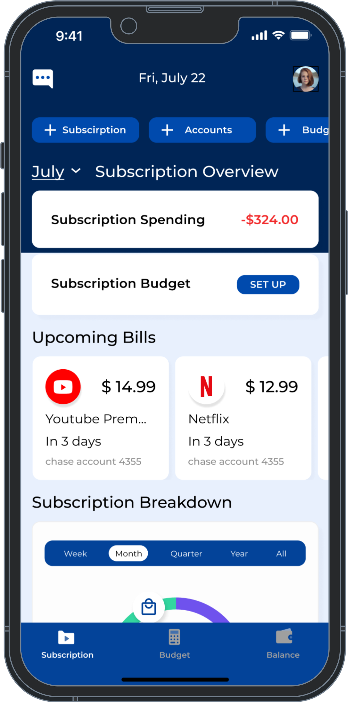
As a current user, I want to see all of my subscriptions in one place so that I can get a comprehensive view of my spending on subscriptions.
As a returning user, I want to unsubscribe from a subscription so that I can reduce needless spending.
As a consumer, I want to be notified if any of my subscriptions are about to be auto-renewed so that I can make a decision about if I want to renew the subscription and continue spending money.
PROBLEM STATEMENT
How might we help users keep track of so many subscriptions?
How might we create a user-friendly and intuitive subscription management service mobile app that helps users keep track of their various subscriptions all in one place, monitor their costs, get notified, and cancel services when necessary?
FINAL DESIGN & FEATURES
3 key features help users better keep track of subscriptions
After exploring different methods and features, these three key MVP features are proven to be the most important features that could keep track of users' subscriptions all in one place, get notified of the auto-renew subscriptions, and have their unwanted subscriptions canceled, eventually helping users save money.
-
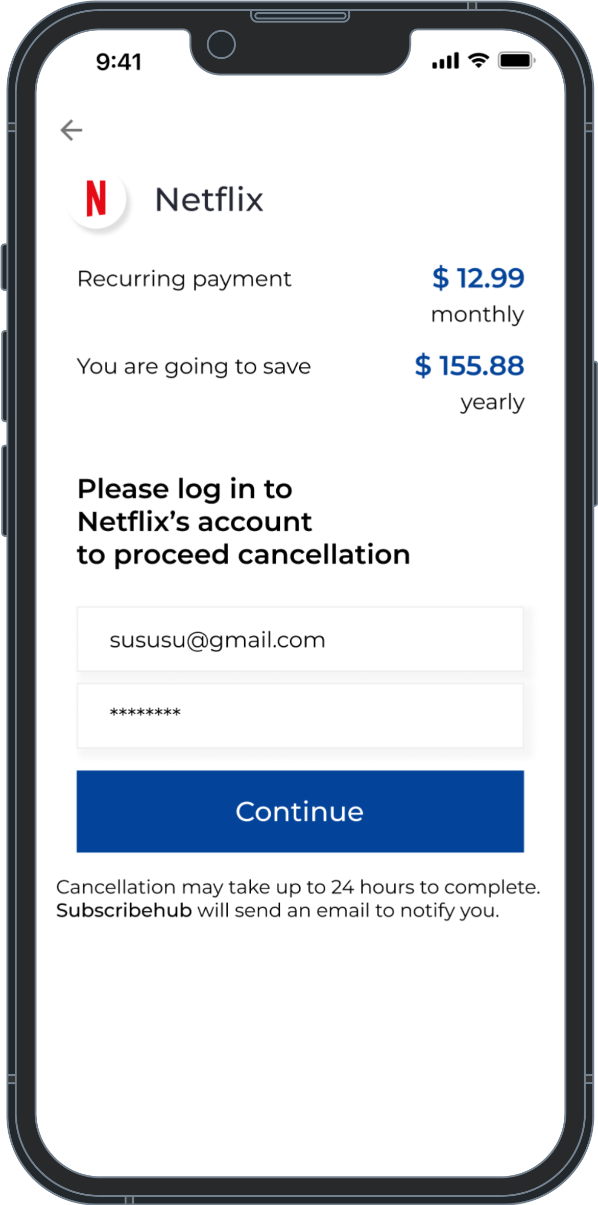
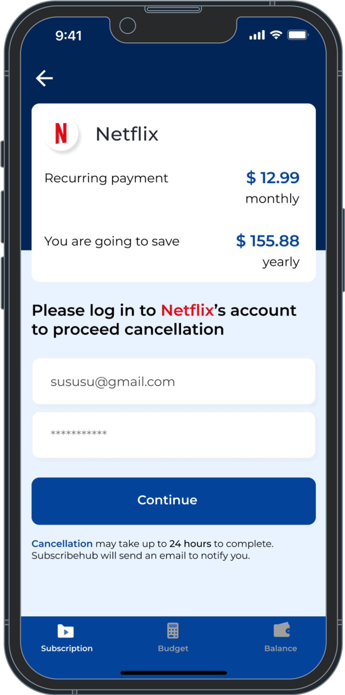
Cancel subscriptions
Subsmanager is committed to helping you cancel any unnecessary subscriptions. You never have to pay for services you no longer require.

-
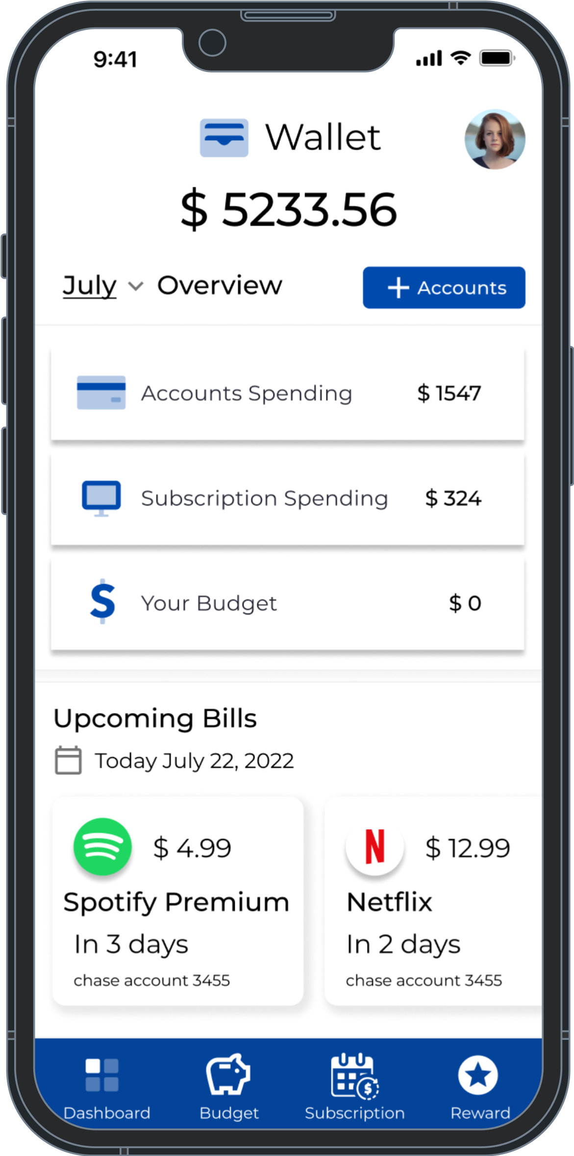
Upcoming Bills Reminder
Upcoming bills reminder feature provides users with a transparent view of the upcoming subscription expenses, enabling them to better anticipate spending.

-
Linking Bank Accounts
Subsmanager allows users to link their bank accounts to the app. Users will save time by having the app auto-detect all recurring and subscription payments.

RESEARCH
Research helps me understand & explore the possibles
I only had 10 days to complete this project. To better understand how to solve these problems, it is best to conduct secondary research & competitive analysis. From here, I can get a sense of what’s out there, in the meantime, understand Subsmanager’s weaknesses and strengths.
RESEARCH- INSIGHT 1
40% of U.S. consumers are very confident in using technology to manage their finances
I looked at four popular financial tracking apps, including Trackmysubs, PocketGuard, Truebill, and Mint. Most of them only offer the option to link users’ bank accounts to the app in order to achieve the goal of saving time and effort.
I was worried about the privacy issue. My secondary research revealed that 40% of US consumers are "very confident" in using technology to manage their finances. You don’t want to lose the market if you want to expand the market reach, so…
How might we allow the users to choose whether they want to add a subscription manually or add their subscription by linking bank accounts?
RESEARCH- INSIGHT 2
Users must log in to their subscription account to cancel the subscription via the app
I did some research on how the app could help users cancel their subscription services. Users must log in to their subscription service account, and once the concierge has this information, the rest will be taken care of, so…
How might we give users the option to cancel the subscriptions in their preferred way?
RESEARCH- INSIGHT 3
Upcoming Auto-renew payments can be reminded
I tried to explore different methods to be the reminder of users’ auto-renew payments, so…
How might we implement the most effective method that could possibly help the users to cancel the unwanted subscription on time?
RESEARCH- INSIGHT 4
Gamification is widely used to motivate user engagement
I explored different methods to encourage users to keep using the app. According to secondary research, gamification is widely used across the app to motivate user engagement, so…
How might we find a way to introduce gamification to the subscription management app?
DEFINITION
User flows organized my thoughts. Sketch & wireframes to test.
As I began thinking about "how might we"s, I mapped out user flows to help me organize my thoughts. The user flows were mapped based on the combination of the user stories given as business objectives and the "how might we"s I needed to solve.
I also started searching for inspiration from Dribble and fintech apps to look for common paths as references, and started to sketch out ideas based on the user flows I created, which I, later on, turned the user flows into the preliminary low-fidelity wireframe and prototyped them for the purpose of doing guerrilla testing instead of spending time conducting user research and interviews.


DEFINITION
Spent 5 hours venturing on the streets to recruit participants for guerrilla testing
To verify the wireframing user flow I created and to obtain feedback, I spent 5 hours in a bustling commercial area and looked for passersby to join my research. If passersby answered affirmatively to my two questions, I asked if they could spare 15 minutes to walk me through how they would cancel their subscription services / get notified of the upcoming auto-renew payment. In the end, I found 5 participants willing to participate in the study.
Do you currently use a budgeting app? ( to ensure they were tech-savvy and familiar with how the budgeting app works )
Do you currently subscribe to more than 5 subscription services? ( to verify their knowledge of subscriptions and possibly the ability to identify any pain points )
GUERRILLA TESTING
Some of the Guerrilla Testing results really surprised me
GUERRILLA TESTING - RESULT 1
Surprisingly, Privacy is no issue
Most participants said it is always nice to feel in charge of an app, such as the ability to add or cancel a subscription.
They also believe that the canceling option needs to be more visible as they sometimes found the feature hidden in some places in other apps.
80%
of participants believe linking bank accounts to budgeting apps improves their financial overview.
GUERRILLA TESTING - RESULT 2
Push-notification is not welcomed
I implemented push-notificaiton to remind users about their auto-renew payment, as this feature is widely used across the app based on my research. However, my Guerrilla testing said otherwise.
According to my research, many people do not believe that this approach would effectively serve its purpose because they had a tendency to automatically ignored the push-notificaiton nowadays.
80%
of individuals hate receiving “push notification” as a reminder, as they don’t believe this approach would effectively serve its purpose.
GUERRILLA TESTING - USABILITY ERRORS
A tangible redeemable reward system could possibly drive more user engagement
People love free stuff, and many apps use game-like elements such as rewards to keep customers engaged based on my secondary research. I explored badges, achievements, and more, but ultimately chose to implement a "reward system" because it encourages long-term engagement. Similar to Starbucks' star system, this approach allows users to redeem tangible rewards, which is more attractive than simply achieving goals or earning badges.
100%
of participants felt that the reward system could boost their motivation to use the app.
“The push notification is disruptive and I would likely disable the feature. ”
“Having a reward system would likely motivate me to see the app more.”
GUERRILLA TESTING USABILITY ERRORS
Oh no! Usability errors were discovered during the guerrilla testing session
80%
of participants think they understand better when seeing a spending category breakdown
80%
of participants ignored a pop-up message requesting users to link bank accounts to the app
80%
of participants expected to see phrases related to "subscriptions" on the landing home screen
DEVELOPMENT
Iterate design based on Guerrilla testing results. Focus on fixing 3 key features
In response to the feedback I received, I implemented various changes based on qualitative data. However, I only got 10 days to complete the project, so I shifted my focus.
The primary focus of the change was to fix the usability problems and focused more on the key features that could help solve the problem statement : 1) cancel subscriptions, 2) get notified when there is an auto-renew payment, 3) view all subscriptions in one place.
DELIVERY
Recruit new participants and test again with usability testing
Getting feedback and insights from doing guerrilla testing saved me some time, so I felt that I do have some time left to do usability testing. I reached out to some UX/UI group communities and recruited 5 new participants who were unfamiliar with my iterated designs. I conducted moderated 30-minute in-person interviews. The objective of this usability testing was to ensure that the user flows and UI design align with the overall needs of the target users. In the meantime, meet the business objective as well.
Please walk me through how you would cancel the subscription service.
You want to be notified when the recurring payment is coming up, what actions would you take?
How would you navigate to view your subscription service overview when you wish to view all your subscriptions?
DELIVERY - FEATURE 1
80% of participants found the subscription list & cancel button easy to find
All users were able to locate the "cancel" button without any difficulties. Additionally, 80% of participants found the subscription list and the cancellation button and they thought the cancellation process was intuitive. Given that all users were able to find the cancel button without any issues, I determined that no significant changes were necessary.
DELIVERY - FEATURE 2
80% of participants successfully noticed the “bank account linking” feature
Users have the options to choose manually adding their subscription or linking their bank accounts. This allowed all subscriptions to be in one place, and it will auto-detect the recurring payment for the users in just a minute.
Additionally, the bank account linking feature needs attention from returning & current users. 80% of users ignored the pop-up message during the guerrilla testing. They assumed the pop-up was an advertisement.
Instead, I implemented a banner directly beneath the subscription budget, highlighted with an orange color to draw attention. As a result, all users noticed the feature, and 80% clicked on the "GO" option to proceed.
DELIVERY - FEATURE 3
100% of the participants found it easy to view and easy to get reminded of
During the user interviews and guerrilla testing, 50% of users dislike push-notifications as a reminder.
Rather than implementing push-notifications, I included an "upcoming subscription bill" section at the top of the screen. This feature provides users with a transparent view of their upcoming subscription expenses, enabling them to better anticipate their spending. 100% of the participants found it easy to view and easy to get reminded of.
USABILITY TESTING RESULT
80% of the participants completed the tasks with no problems
Based on the usability testing metric, with this iterated version, some of the participants really like the “upcoming bills reminder” feature.
-

Participant 1
“The design of this app is clean and straightforward, I really like it.“
-

Participant 4
“I really need that upcoming bills as a reminder feature to help me with my subscription”
BRANDING
Trustworthy blue + Money green = Subsmanager brand
Subsmanager’s brand identity has been identified as 1 ) a trusted friend who is helping you save money. 2) this app is trustworthy, caring, friendly, and casual.
Based on my secondary research, blue and green colors are commonly utilized in finance apps, so incorporating them is a safe choice. Combining blue and white can be an excellent option for a finance app, as it conveys a sense of reliability while still maintaining a friendly vibe.
In this day and age, finance and banking no longer need to adhere to traditional methods. The font I have chosen gives off a modern and professional vibe, which is commonly used in fintech applications.
TAKEAWAYS
Given more time, I’d dig into the the “reward system” gamification
Designing an end-to-end project within 10 days is not impossible. Honestly, I was intimidated by the 10 days period time frame because I thought the whole design process, especially the process of recruiting the right people and conducting usability testing could really take a long time.
Looking back, I could have avoided losing sight of the project's scope by defining the key features earlier. This would have saved me more time, but I actually don’t regret what I did because I get to explore different methods and find a way to possibly add more value to this mobile app. For example, this gamification idea would not be brought up and loved by participants if I hadn’t explored more options. However, meeting the deadline promptly is definitely more important.
TAKEAWAYS
Find ways to make it more accessible, like “voice assistance”
Based on my research, 100% of participants loved the idea and felt that the reward system could boost their motivation to use the app. Unfortunately, the reward system feature was out of the scope, but I would love to implement it and test this hypothesis again if I had more time.
I spent too much time creating mid-fidelity wireframes for this project. To reduce the time spent on creating wireframes, I would utilize placeholders, boxes, and buttons for guerrilla testing purposes. This approach would enable me to spend less time on designing and more time on identifying pain points and understanding the needs of potential users.
To increase the precision of the usability testing outcomes, given more time, I would have the participants complete a survey at the end of the moderated testing session utilizing the System Usability Scale (SUS) scoring method. This would enable me to obtain a more detailed understanding of their thoughts on the app in the most effective way.
Voice assistance is very widely used nowadays. If users do not wish to link their bank accounts, I would explore implementing a voice assistance feature to ease the process of adding their subscription. The voice assistance feature could also be more accessible to the elderly who is not tech savvy, and minorities such as the blind people community.
This idea has potential, but its implementation and impact need to be carefully considered.

-
ECHELON
Web-3 Job Searching/Recruiting App Creation
-
WORKSPOTTER
Streamlining the Search for Remote Workspaces
-

EARTH HERO
Carbon Emission Action Progress Information Architecture Redesign


