WORKSPOTTER
Design Sprint l UX/UI Design
Implementing Workspace Subscription-based Service
A mobile app WorkSpotter is a new startup where freelancers and remote workers share tips and advice. It recently has seen lots of feedback and discussions about how to find good public places to work from.
Role l UX/UI Designer
Tool l Marvel, Figma, pen, paper, Miro
PROBLEM STATEMENT
Finding suitable places to work is time-consuming for remote workers who travel from place to place
INFORMATION
Diverge and converge ideas to sort out pain points, needs, and wants. Voila! User persona created
Based on the given information, such as the research and interviewing results. I could see different users’ patterns in their behaviors. I sorted out their pain point, needs, and wants, and I was able to create 1 main persona for reference.
-

Beth
“I like to find places where other people go to work, they are usually more friendly toward me setting up my laptop and working.”
-

James
“I like to know how crowded the place is. If I am meeting clients or coworkers there, I want to be sure we can get a place to sit and talk for a bit.”
-

Andy
“I usually need to jump on the computer for a video chat, so I need to make sure the Wifi is good, and that there isn’t too much background noise”.
DESIGN SPRINT PROCESS
Putting Google Ventures’ 5 days design sprint method into practice
DAY 1 - MAP
Identify pain points and comes up with user flows based on given information
In order to address the issue, I initially structured the information and sought to identify the pain points and business objectives.
Pain Points
Due to the abundance of information on websites, it can be time-consuming to gather relevant information quickly.
It is difficult for users to determine whether a coffee shop has enough space and whether it is crowded.
Social media reviewers often do not provide any information about amenities related to working.
Business Objective
To introduce a subscription service to the app in order for the users to access unlimited searches for places to remote.
To ideate and sketch out possible ways to implement “remote working places” to PostUp.
DAY 2 - SKETCH
Sketched out ideas using crazy 8 methods. Research and sketching lead to innovative ideas suprisingly
Competitive Research
Before sketching, I did some research and got some great ideas from Yelp, Google Map, Airbnb, Doordash, and Matterport.
Incorporate 3D Technology
Integrating new technological features is an effective means of improving the user experience, as they tend to be more efficient and less time-consuming. With the 3D walkthrough feature, users can quickly assess the spaciousness of a location with just a single click and minimal scrolling.
As a result, I made the decision to incorporate this concept into the PostUp application and elevate it as one of its key features, setting it apart from other competitors in the market.
Sketches
I used the crazy 8 sketching methods to sketch out a bunch of ideas for the most critical screen – the main screen.
DAY 3 - DECIDE
Decide the final user flow was already difficult. But I faced another challenge
Using competitive research and heuristic hierarchy. Determine the most critical screens and user flows
Using the heuristic hierarchy and the insights gained from my competitive research, I selected a sketch that would deliberately lead users through the application's most important functionalities.
From there, I proceeded to outline the user flows and made note of any potential interactive elements.
By selecting this particular user flow, my intention was to keep the flow as streamlined as possible and ensure that every element on the screen served a purpose.
Challenge: How do I introduce a new feature (subscription based service) to the user in an app ?
Another challenge I faced was how to introduce a “subscription service” to the users.
As a subscription-based business model startup, one of PostUp's primary objectives is to increase its user base by encouraging more individuals to sign up for memberships.
To achieve this goal, I explored two potential solutions:
How might we allow users to try the app for seven days without requiring them to commit to a subscription?
How might we introduce the "unlimited access" feature to the app?
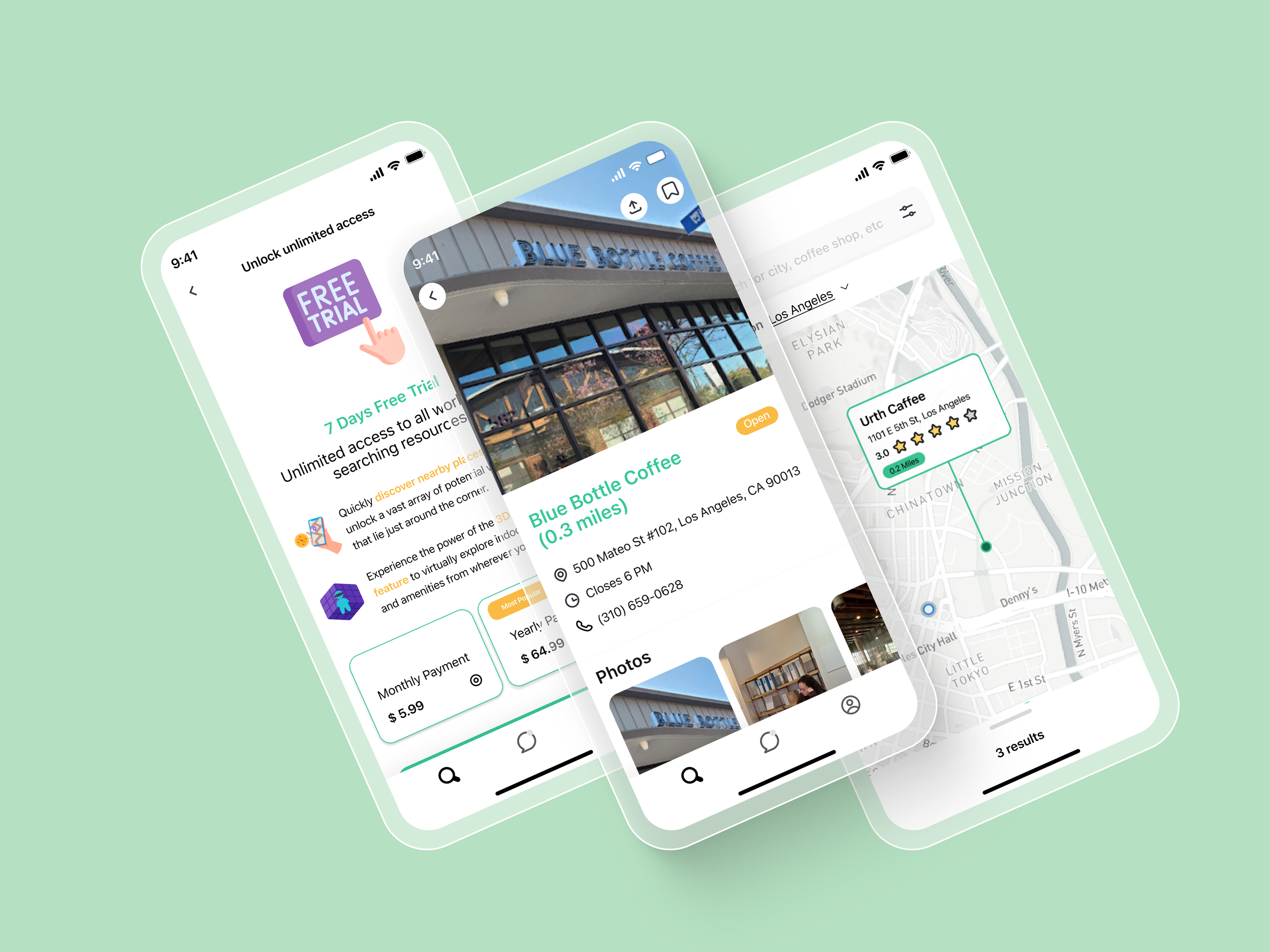
By implementing a free trial period, users can test the application and experience its value proposition without being bound to a subscription. This approach provides users with a low-risk opportunity to determine whether the app aligns with their needs and preferences, ultimately increasing the likelihood of conversion to a paid subscription.
Possible Solution: implement a banner at the top of the screen to introduce the “unlimited access subscription” feature
DAY 4 - PROTOTYPE
Completed the prototype for future usability testing purposes


DAY 5 - TEST
Test the prototype. Identifying and addressing usability issues was the primary goal
At the conclusion of an entire day's prototyping process, my top priority was to ensure that the prototype was user-centric. To achieve this, I recruited potential users to participate in usability testing and assess the prototype's usability.
I conducted one round of usability testing, using moderated remote tests via Zoom, with 6 freelancers. During the testing phase, I assigned them three tasks to complete. The objective of these tests was to identify and address any potential usability issues and ensure that every interaction and flow in the prototype made sense to the users.
Additionally, I was vigilant about ensuring that all text, photos, and colors used in the prototype were readable and accessible to users. This comprehensive approach to testing helped to ensure that the prototype was optimized for user experience and satisfaction.
TEST RESULT
80% of the participants expressed interest to use the innovative “3D walkthrough” function to explore a potential workspace
Following the usability testing, several key insights were gained:
A significant majority (80%) of users preferred to use the map function to locate a coffee shop where they could work.
The 3D walkthrough virtual tour function was also a popular choice among users, with 80% indicating that they would very likely use this feature to explore a potential workspace.
Photos were an essential factor for users when deciding on a location to work from, with 80% relying on them to make a decision.
These insights could be valuable in guiding the further development of PostUp and ensuring that the application's features and design align with users' preferences and expectations.
-

TingTing
“Adding 3D technology to this app is a brilliant idea.”
-

Rabia
“The UI design looks clean and most of the flows are intuitive.”
BRANDING
Developed the new UI design using PostUp’s original design system and branding guidelines
Color Palette
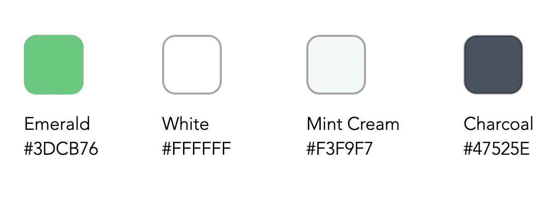
I picked up PostUp’s color scheme and decided to go with their brand colors white & green, making sure the entire app stays consistent.
UI Design
I set the background color to white, which allowed for greater flexibility in choosing text colors. I also utilized a color accessibility checking tool to ensure compliance with WCAG guidelines.
To enhance the call to action and promote brand recognition, all buttons were made green. Given the significance of photos to users, they were given prominent placement.
To enhance usability, I paid close attention to negative space and incorporated ample breathing room, which resulted in a clean and straightforward design without compromising professionalism and trustworthiness.
As the design sprint is a rapid 5-day process, I tried my best to gather all necessary information and addressed the problem statement with most of the essential elements required, however, some usability issues still occurred.
To avoid repeating similar errors in the future, I created a UI design principle checklist that could serve as a helpful reminder and a valuable reference tool.
In determining the optimal placement of the paid-subscription entry point, I should’ve researched more about membership subscription processes from various other applications. By doing so, I could gain a better understanding of how to improve the conversion rate while avoiding user frustration.
TAKEAWAYS
To avoid making similar mistakes, I created a UI design principle checklist.

-

ECHELON
Web-3 Job Searching/Recruiting App Creation
-

SUBSMANAGER
Monthly subscription-based service management tool
-

EARTH HERO
Carbon Emission Action Progress Information Architecture Redesign


